Subscriptions for Loco Streamers
Designing a subscription experience that helps streamers build recurring income while giving viewers meaningful ways to support their favourite creators.
Research
Userflow
UX design
UI Design
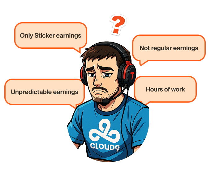
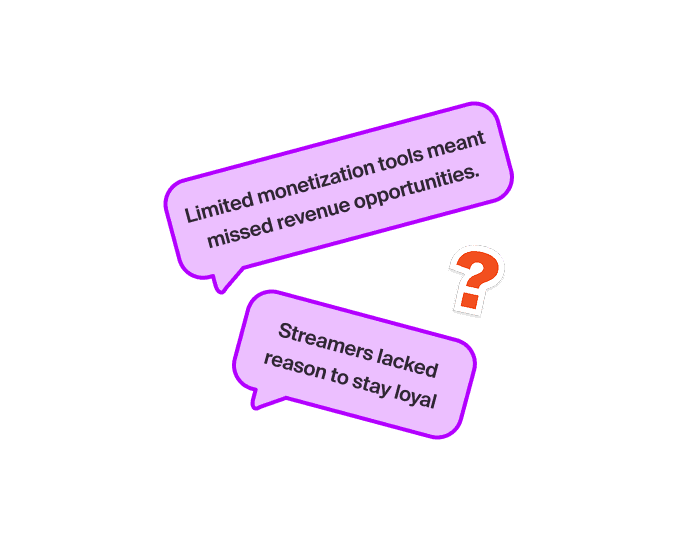
Loco streamers primarily earned through one-time gifts and stickers. While these features helped creators monetize individual streams, earnings remained inconsistent and viewers had limited ways to show long-term support.
We saw an opportunity to introduce subscriptions: a recurring monetization model that could help creators build a more predictable income stream while giving loyal viewers recognition, exclusive access, and a stronger sense of community.
Role
Product designer
Timeline
2 weeks
Platforms
Web, iOS, Android
Team
Product, Design, Engineering
Streamer
Viewers
Business
Without subscriptions, Loco lags behind competitors like Twitch and YouTube in offering sustainable monetization features.

Streamer side
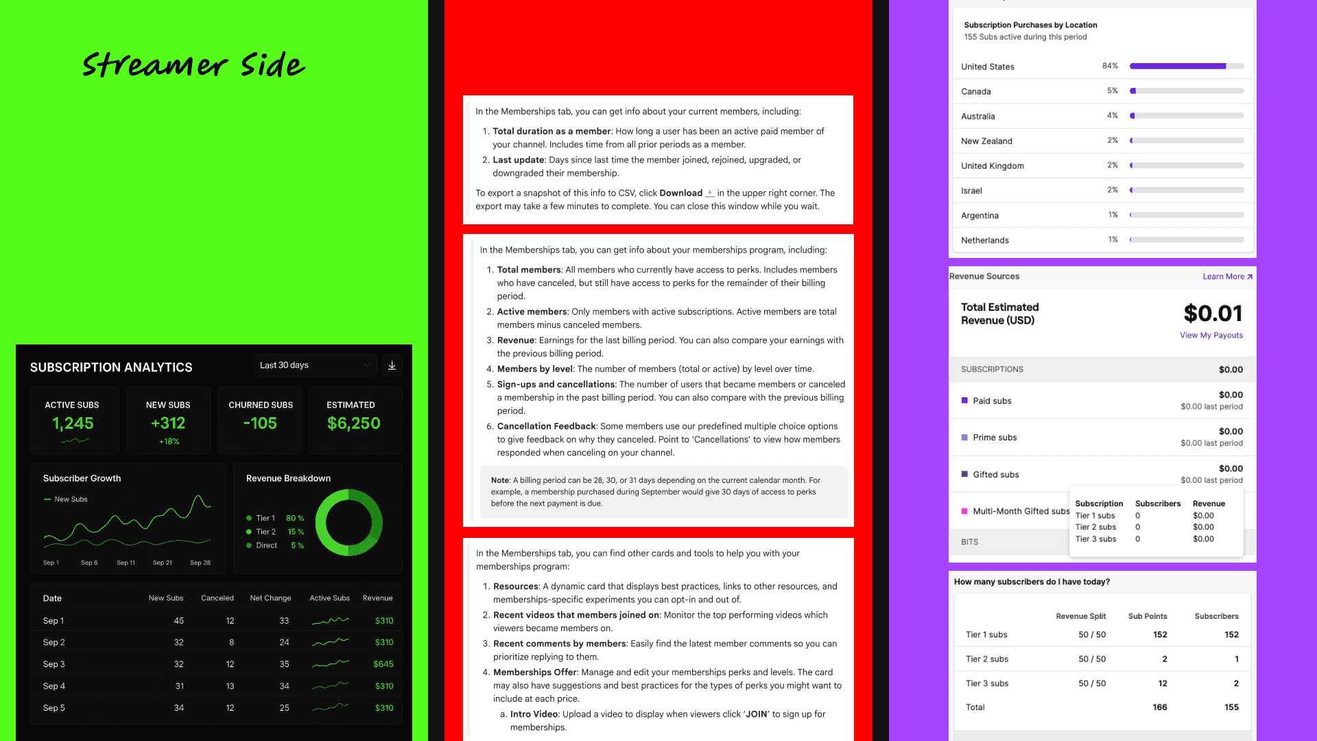
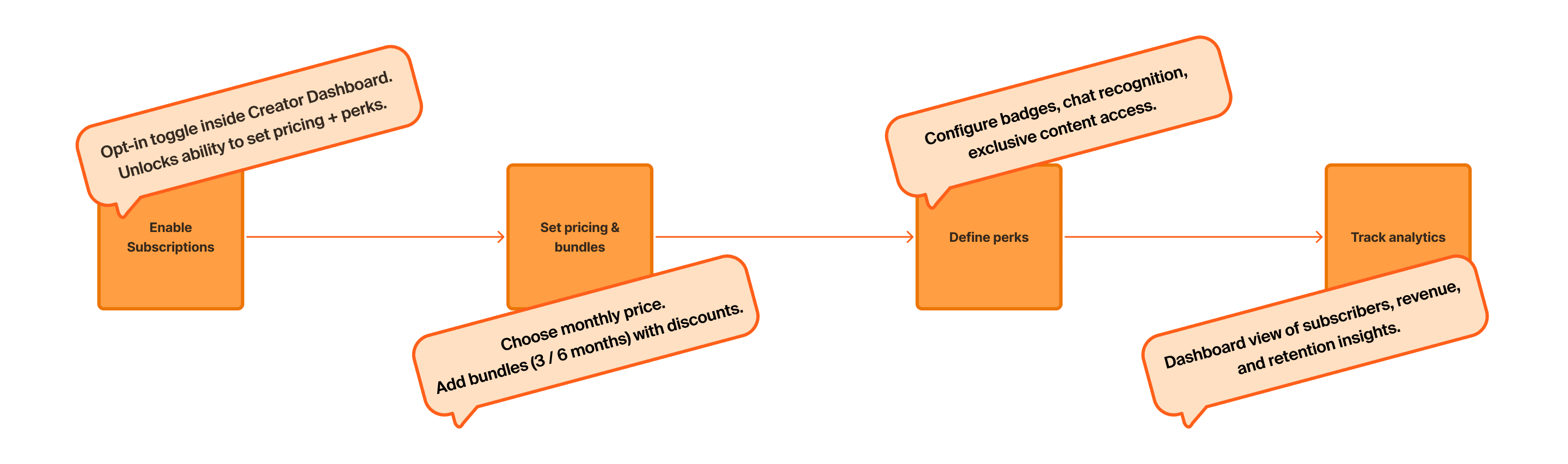
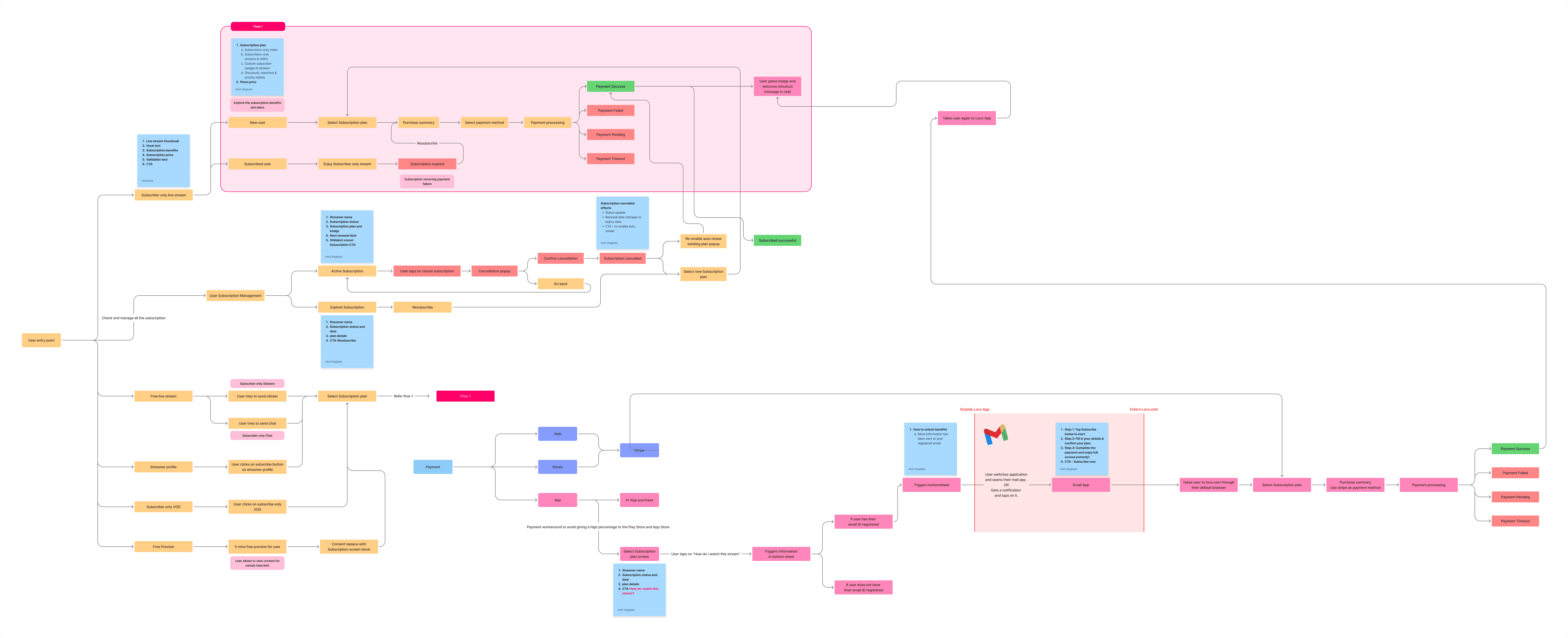
On the streamer side, I designed how creators enable subscriptions, set their price, offer bundles, customize badges, and later see who subscribed and how much they earned.
Pricing setup
Bundles
Stickers
Badges
Analytics
Payout
Viewer side
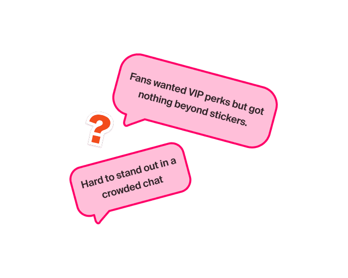
On the viewer side, I worked on the subscribe flows, the nudges during streams, the look of subscriber-only chats, and the way badges and perks show up. Even the small detail like “you can preview this stream for 5 minutes before subscribing” came out of this design work.
Subscriber only chat
Subscriber only stickers
Badges
Subscriber only videos
Monetization Model
Revenue Split
Regional Pricing
Badges & Emotes
Sub-Only Features
Discovery & Conversion
Analytics
Community Features
Mobile/Web Handling
Refund Policy
Strengths

Multi-tier (3 tiers: $4.99, $9.99, $24.99) + Prime Sub

Localized pricing (PPP)
50/50 (Affiliate), 70/30 (Partner)
Customizable badges + emotes
Sub-only chat, streams, videos
Loyalty badges, streaks, shoutouts
Deep community features + perks
Detailed sub sources, retention
Sub button, gifting, hype trains, sub goals
Web preferred, price uplift on mobile
Restrictive, region-based

Up to 6 creator-defined tiers
70/30 (standard)
Localized auto-adjusted pricing
Custom badges + emojis
Members-only videos, live chats, streams
“Join” button, gifting, promos, free trials
Comprehensive (acquisition, churn)
Community posts, polls
Price uplift on mobile
Restrictive
Tier flexibility + creator control

Single tier ($4.99 only)
Flat pricing (~$5 globally)
95/5 (very streamer-friendly)
Basic badges + emotes
No sub-only streams yet
Limited gifting, no big conversion nudges
Basic, limited tools
Basic recognition, fewer perks
Price uplift on mobile
Restrictive
Best revenue split
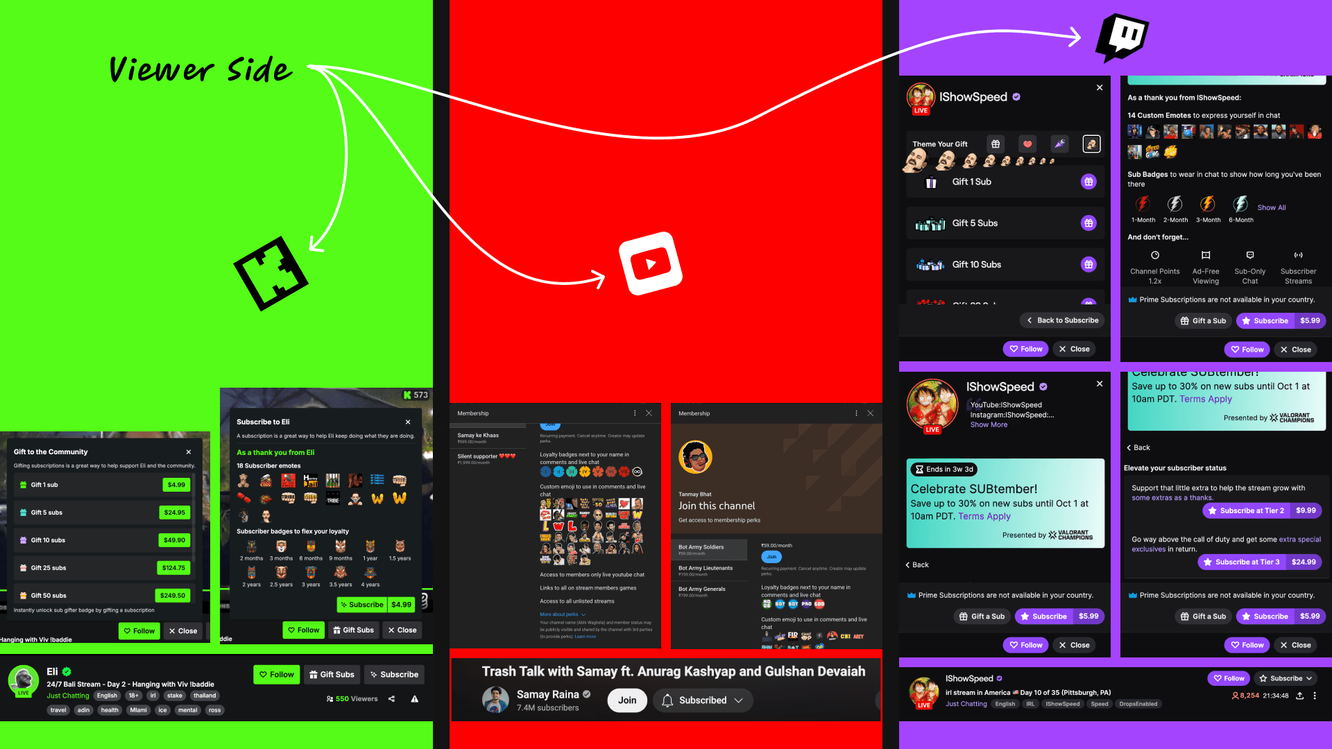
Badges in chat to showcase subscriber status.
Tenure-based progression (1M, 3M, 6M, 12M).
Sub-only chat and perks that reward true fans.
Too many tiers create complexity
One membership with flexible duration
Instead of introducing multiple benefit tiers in the first version, we created one membership with multiple subscription durations.
Problem
Too many tiers would increase setup and comparison complexity.
Decision
One subscription offering with multiple durations.
Result
Simpler setup for streamers and easier plan comparison for viewers.

Make the value visible before payment
We surface subscription at moments where viewers could clearly understand the value exclusive content, gated chat, preview access, and community recognition.
Problem
A static paywall would make subscriptions feel transactional and easy to ignore
Decision
Introduce subscriptions contextually when users encounter exclusive experiences
Result
Higher perceived value and a clearer path from discovery to conversion

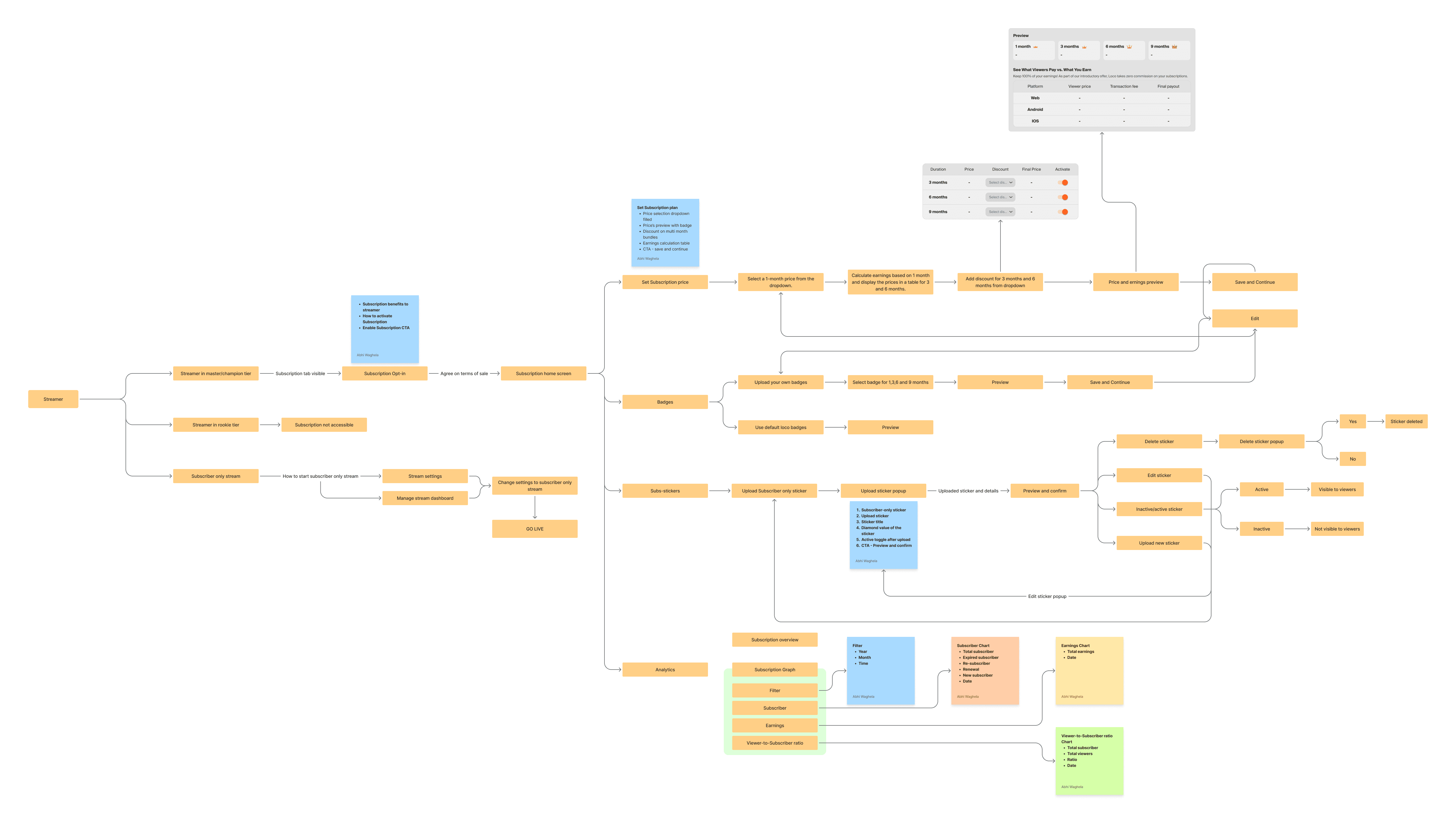
Viewer Subscription Journey
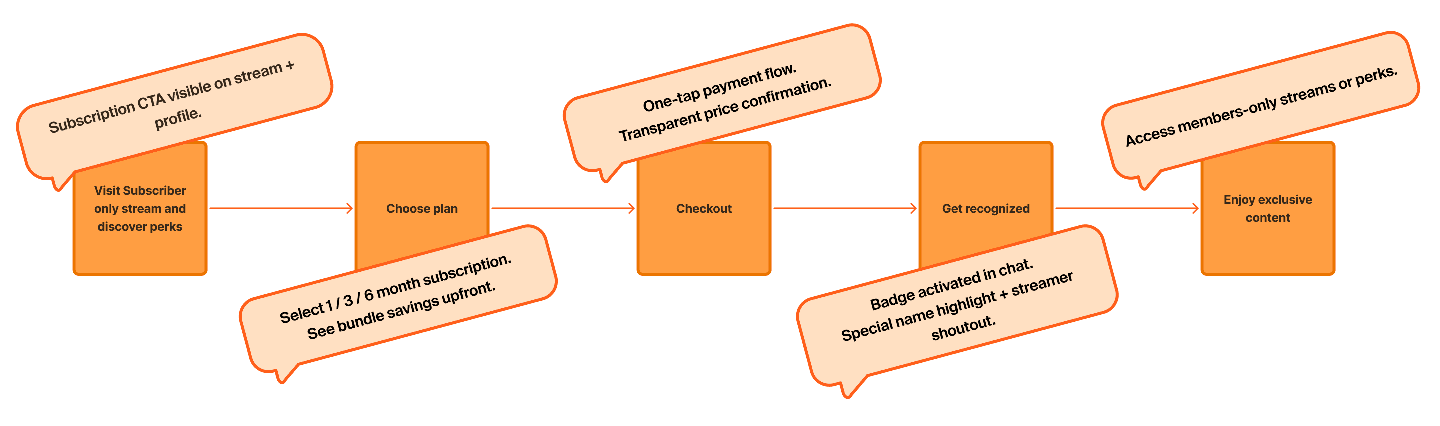
Wireframes
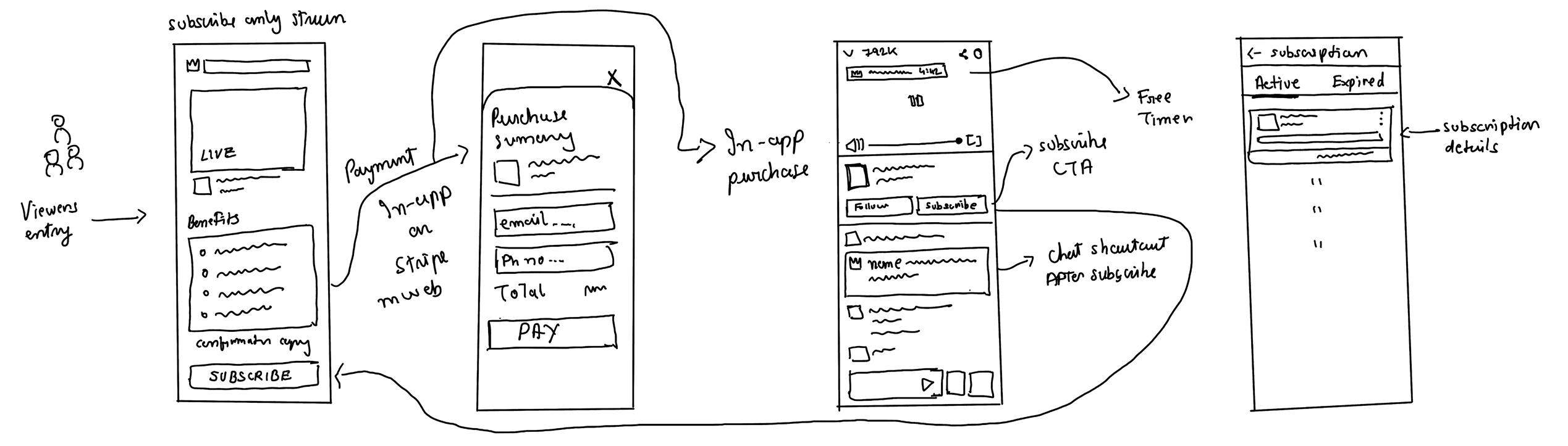
Subscription only stream screen
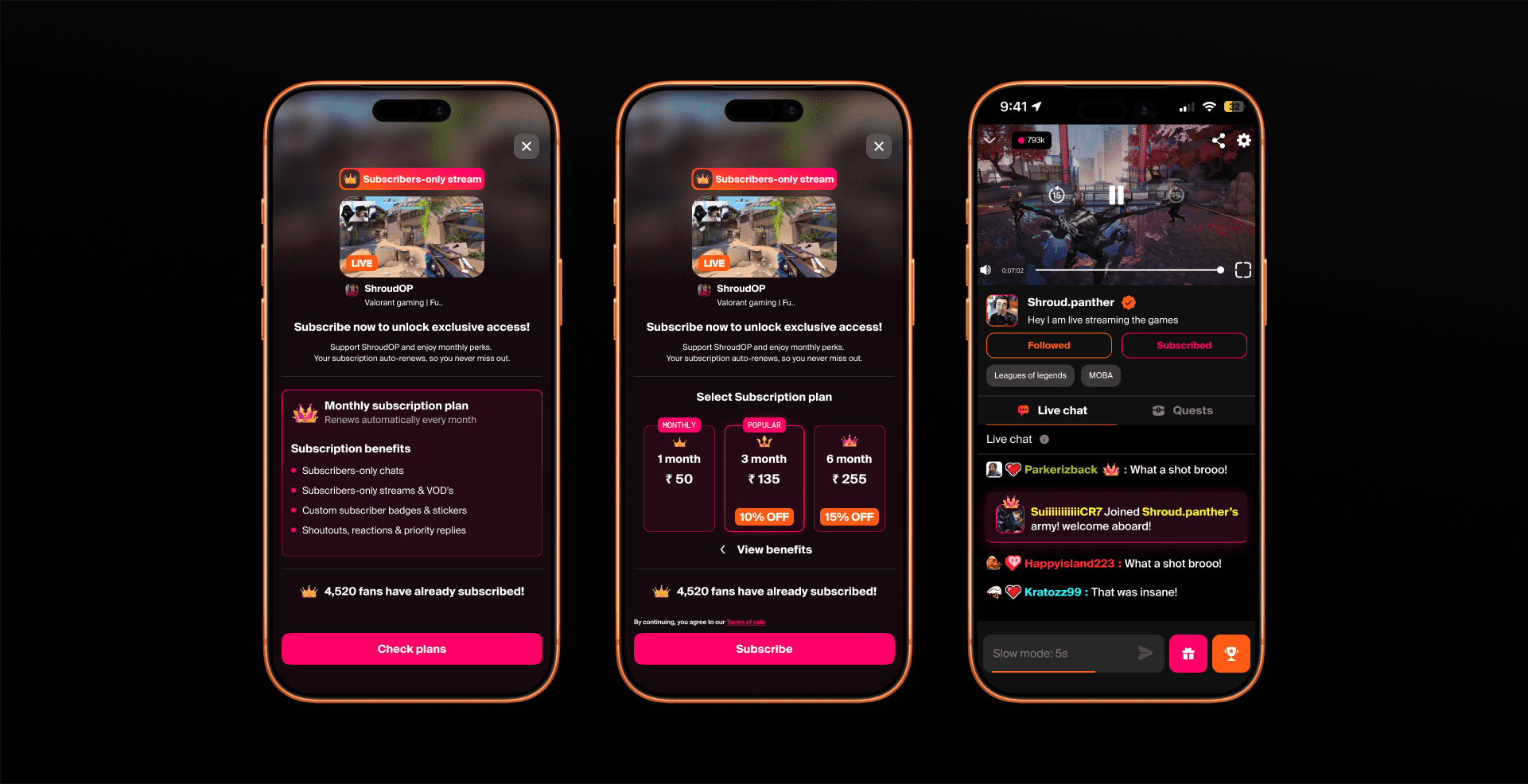
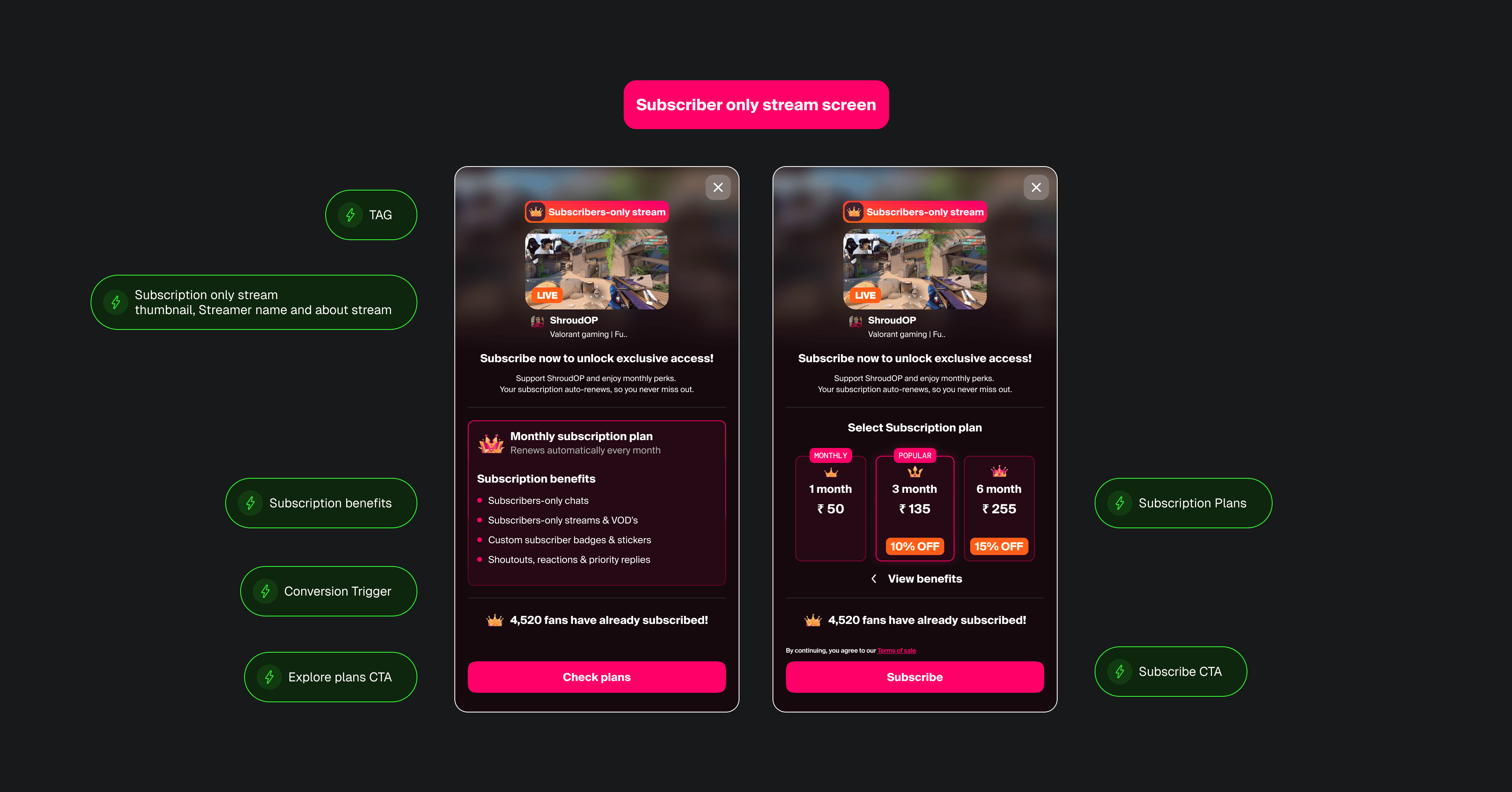
The first and most important screen for a viewer is the Subscriber-Only screen. A viewer lands here whenever they try to access a subscriber-only stream. This can either appear as a full screen or as a popup, depending on the context.
If the viewer is already a subscriber, they can watch the stream directly. If not, they’re taken to this screen where we clearly show:
The Subscriber-Only tag, streamer’s thumbnail, and live status
The benefits of subscribing
A short, reassuring message to build confidence and reduce hesitation
And finally, a clear Subscribe button
The goal of this screen is to highlight exclusivity, communicate value, and nudge the viewer toward subscribing without feeling forced.”
Purchase summary
Subscribed to stream
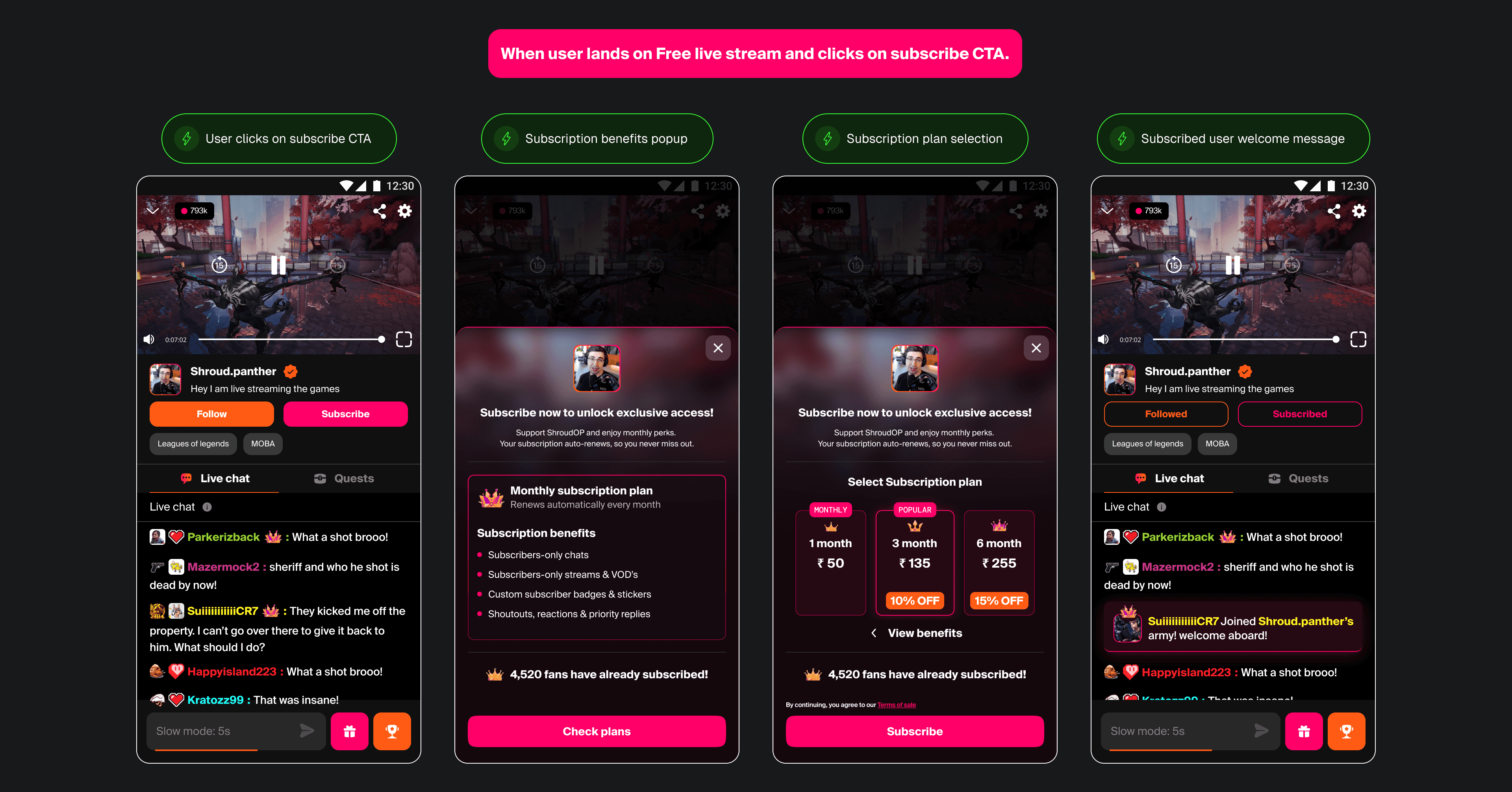
Subscribe button under the livestream
If the stream is free but a viewer still wants to support the streamer, they can tap the Subscribe button below the player. This button is visible to all new users sparking curiosity and driving exploration.
Free preview for Subscriber-only streams
Streamers can allow a 5-minute free preview of subscriber-only streams. This builds FOMO and gives viewers a taste of what they’re missing. Once the preview ends, viewers are redirected to the Subscriber Benefits screen.
Welcome & shoutouts
After subscribing, viewers instantly receive a welcome/shoutout message in chat from the streamer making the experience feel special and rewarding.
Subscriber-only chat & stickers
If the livestream is free but chat is set to subscriber-only, non-subscribers trying to chat will see a Subscribe popup.
The same applies to subscriber-only stickers viewers must subscribe to unlock them.
Subscribed to stream
Opt-in & pricing
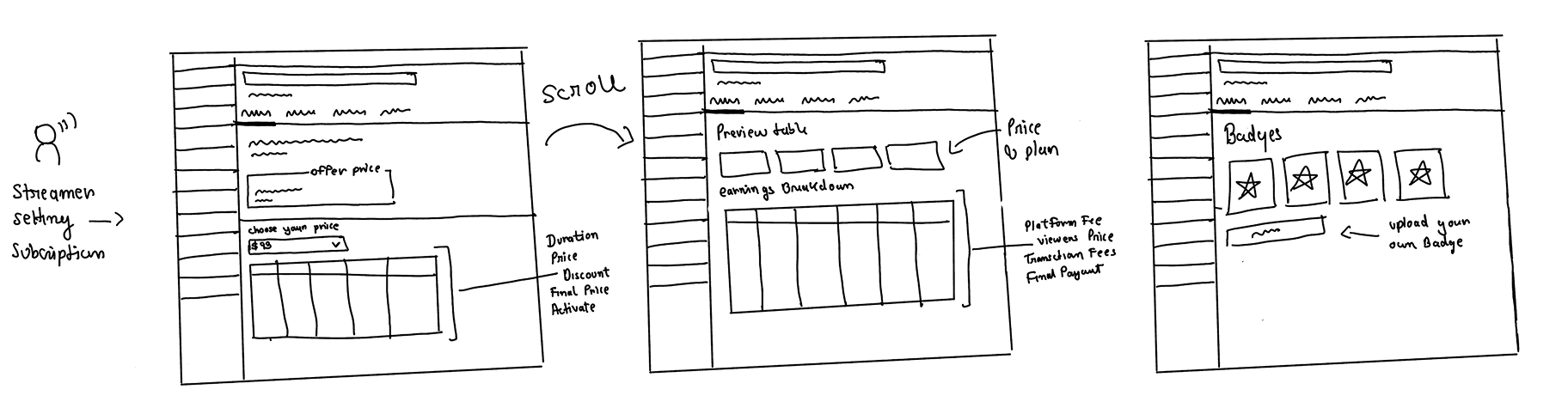
The streamer opts in to subscriptions and sets the base price for 1 month.
Auto-generated packages
Based on the 1-month price, the system auto-calculates 3, 6, and 9-month packages. Streamers can then add discounts to long-term packages, and the final prices are displayed in a table.
Table Includes:
Package duration
Base price
Discount (editable via dropdown)
Final price
Bundle activation toggle
Earnings calculation
Once pricing is set, the streamer sees an earnings breakdown showing:
Viewer price
Platform fee
Final payout
Save & Publish
At the bottom, a Save & Publish CTA lets streamers confirm their setup. The final prices are then shown to viewers on the subscription screen.
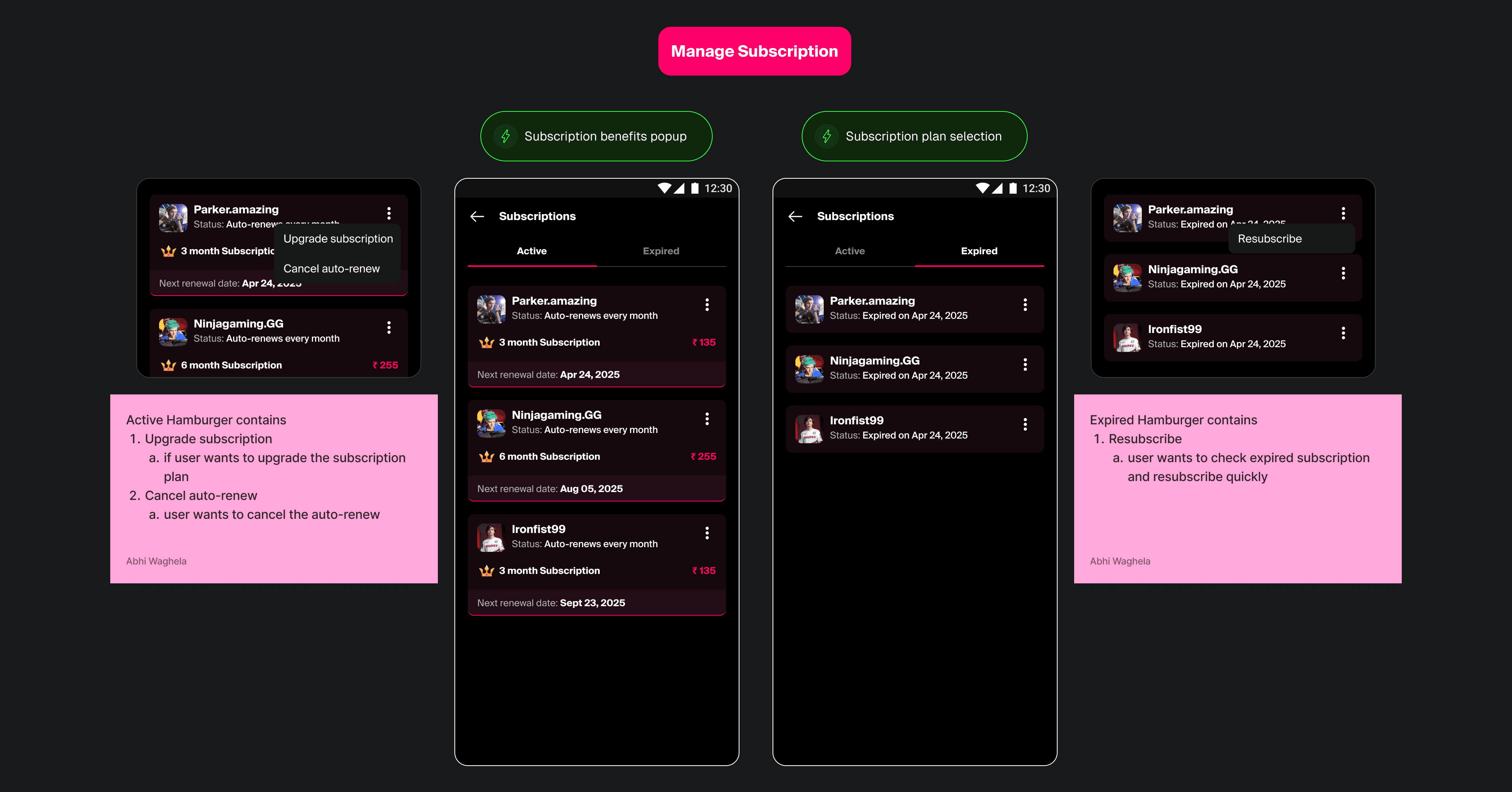
Just when we thought the viewer subscription flow was complete, a new challenge surfaced, one that wasn’t about design screens at all, but about App Store rules and business revenue.
Problem
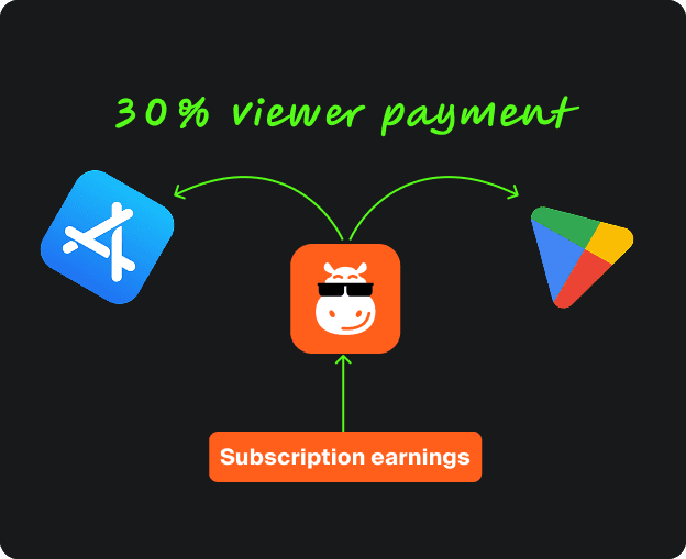
App Store & Play Store charge 30% commission on in-app subscriptions.
Over time, this would erode streamer payouts and platform margins.
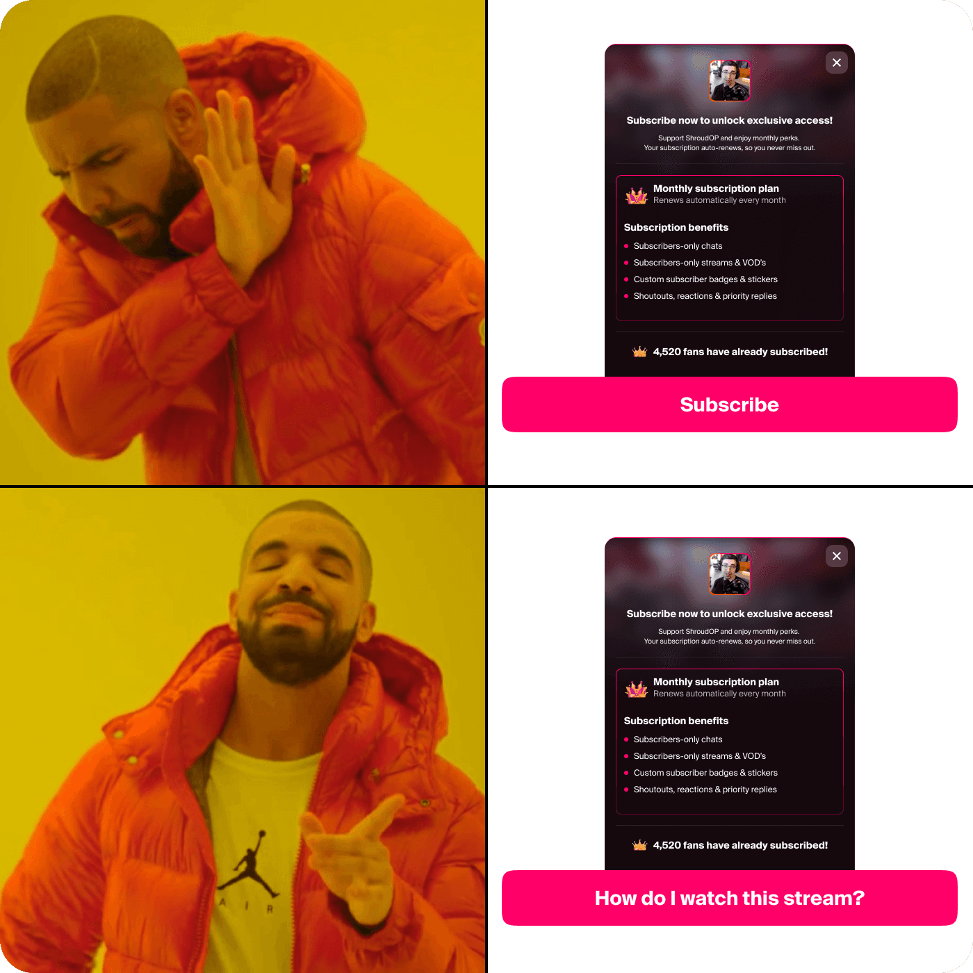
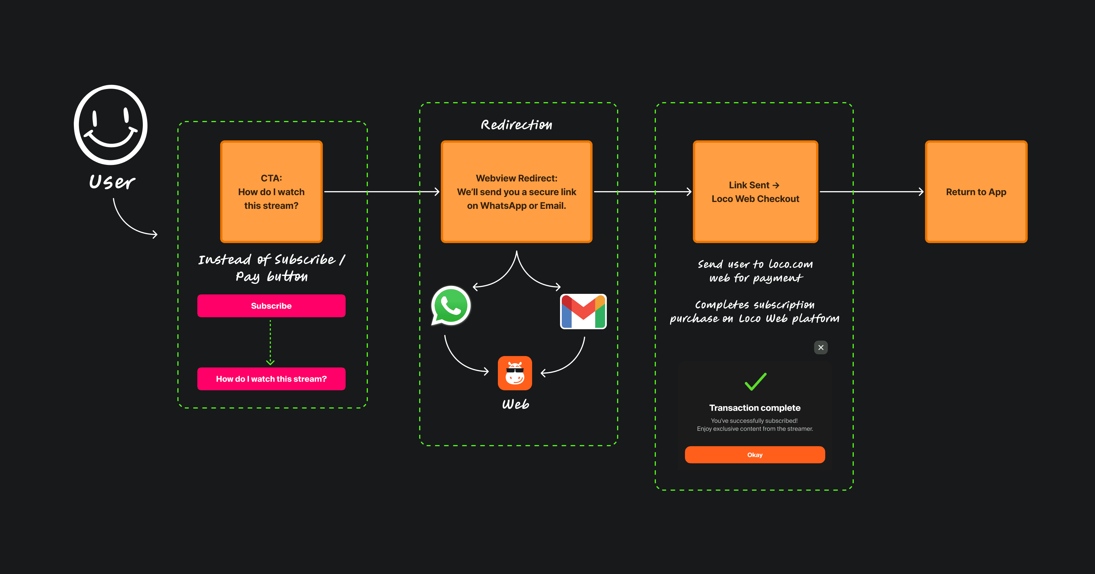
But → their policies prohibit third-party payments inside the app.
So we couldn’t simply add “Pay on Web” as a button.
From a Business Lens
From a UX Lens
From a Personal Lens
Learned to collaborate deeply with PMs, backend, and ops to align logic, API feasibility, and streamer experience.
Learned how to future-proof designs (custom badges, gifting, streaks) without overloading v1.
Learned that good design is not only about solving for the user, but also for the business and platform sustainability.